Team
Project Manager: Colette Bersie
UX Researcher: Andrew Perry
My Role
UX Designer
Time
6 Weeks, Summer 2021
Tools
Pen and paper, Figma(FigJam), Adobe Illustrator, Maze
Overview
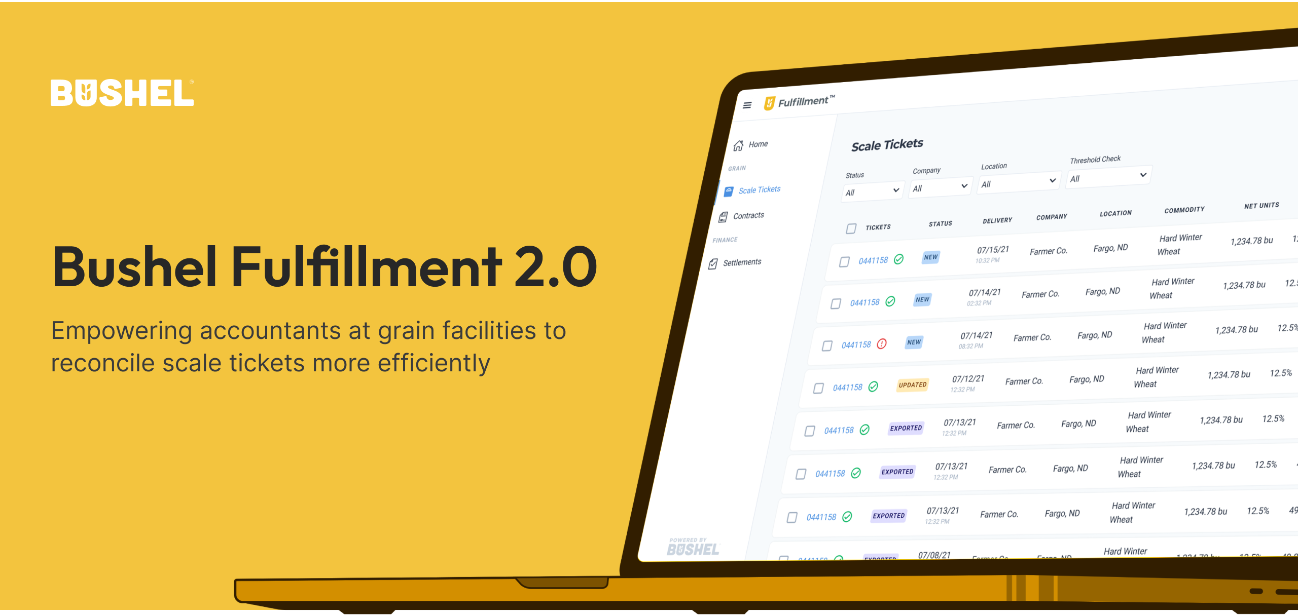
In the summer of 2021, I interned at Bushel, an agriculture tech company that provides software solutions for the grain industry, which traditionally relied on paper and in-person transactions.

PROBLEM
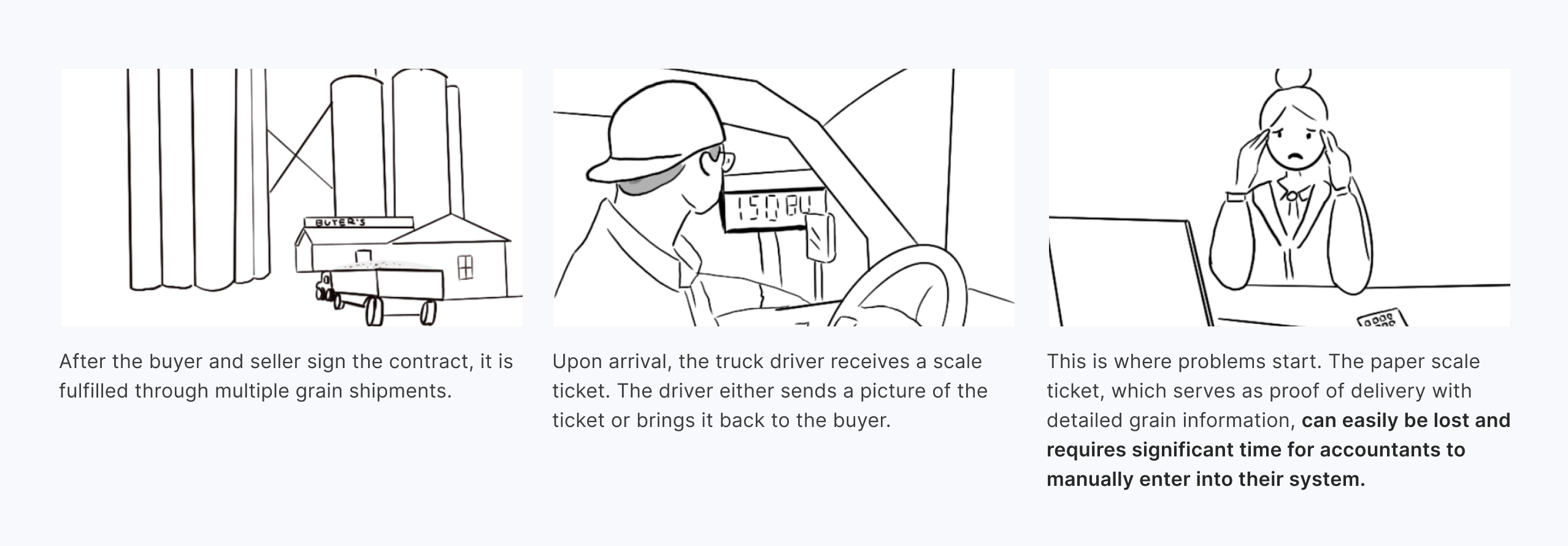
So, what is the primary pain point in the other part of the supply chain?
CURRENT SOLUTION
Bushel Fulfillment 1.0
Bushel Fulfillment 1.0 addresses this pain point by integrating with the main Enterprise Resource Planning (ERP) software used for accounting at grain facilities. This integration pulls scale ticket data as soon as it's created in the buyer's ERP. Sellers can then receive email notifications with all the scale ticket information on a schedule they choose. Accountants can now simply download the CSV file and import it into their ERP instead of manually inputting all the data. This has saved a significant time of our target users.

GOAL
Okay, then what is Fulfillment 2.0?
During my internship, I was given a task to explore:
🧐 What is Fulfillment's potential for an expanded web experience?
DISCOVERY
But why do we need to do this if email notifications have already addressed this time-consuming and laborious problem? 🤔
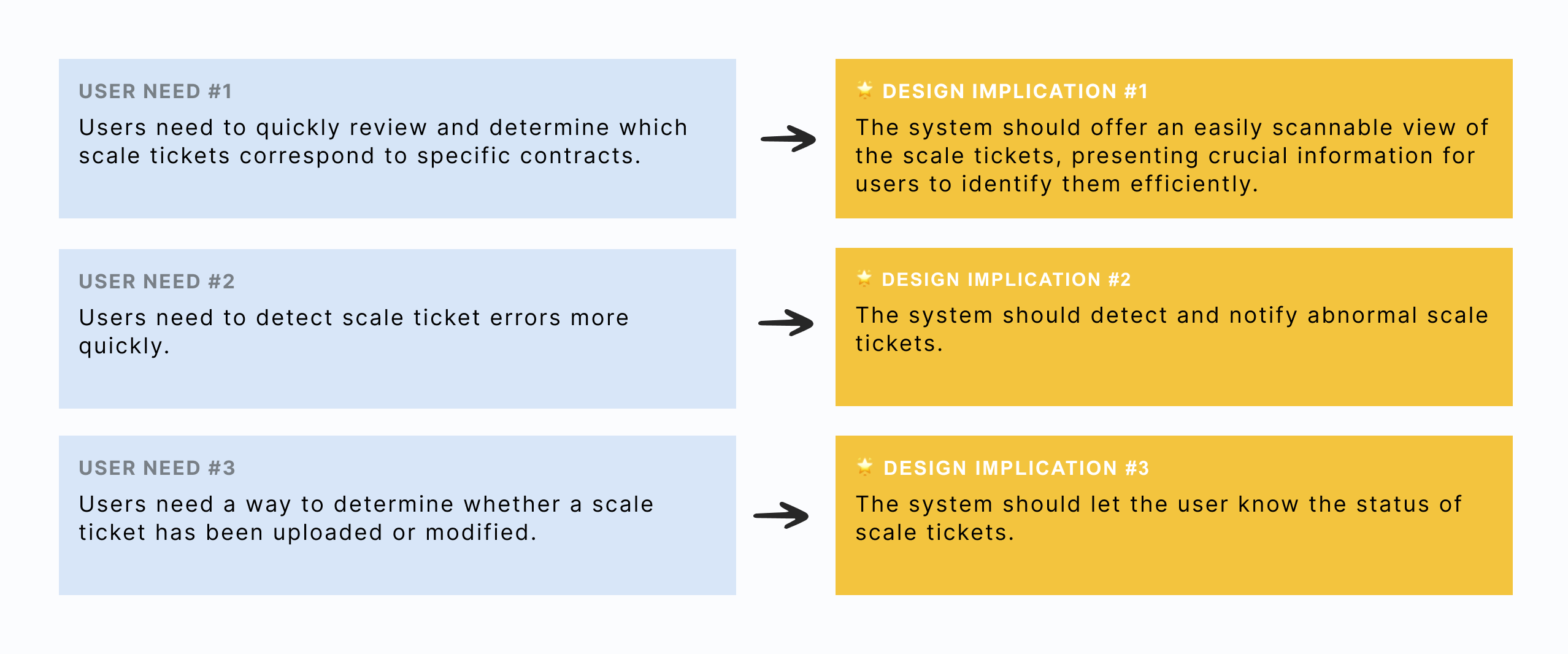
After a workshop with internal stakeholders to align the team, I collaborated with the researcher to conduct user research to validate and identify several unresolved issues that could be addressed through a web experience. We then met with the team to prioritize the three main problems:

DEFINE
After understanding the pain points, how might we

USER NEEDS & DESIGN IMPLICATIONS
Establish my north star before designing
Ideation and feature prioritization
With the user needs in mind, I brainstormed some ideas and collaborated with my PM to decide the concept and scope of this project. Together, we created a prioritization list for all the features we wanted to include, sorting them by using the MoSCoW method.

More research was done INTERNALLY to inform the design
Due to time and resource constraints, I reached out to a few colleagues who are familiar with scale tickets and grade factors. They helped me address two research questions, which were crucial for making design decisions.

DESIGN
Option 1 or 2: that is the question
Throughout the design process, users were not available to provide feedback or participate in testing. Therefore, I had to rely on existing data and my expertise to make certain decisions.
UI decision #1
The ultimate goal for users utilizing this tool is to export all new scale tickets and import them into their system. Thus, it is essential to make this process quick and easy. Therefore, I came up with two options:
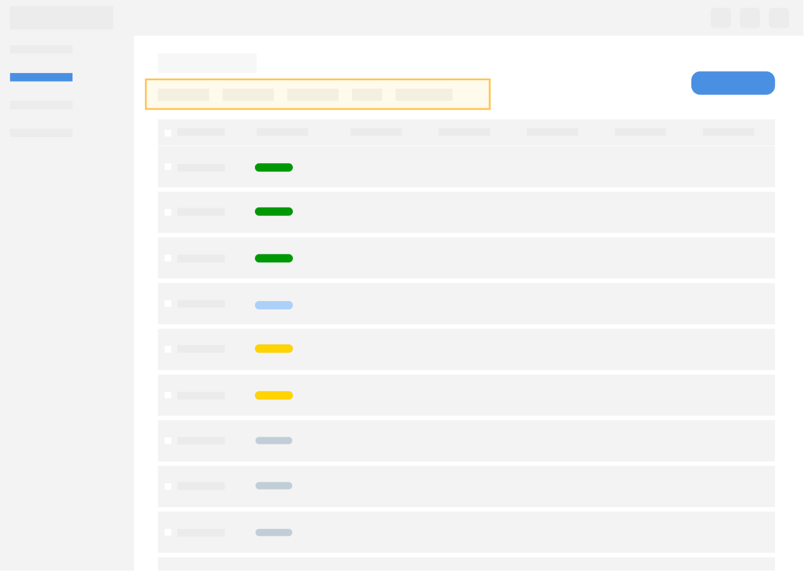
Option 1: Filter for scale ticket status
Pros: Everything on one Page; More flexible in configuring the view
Cons: Requires additional steps to filter out all "NEW" items
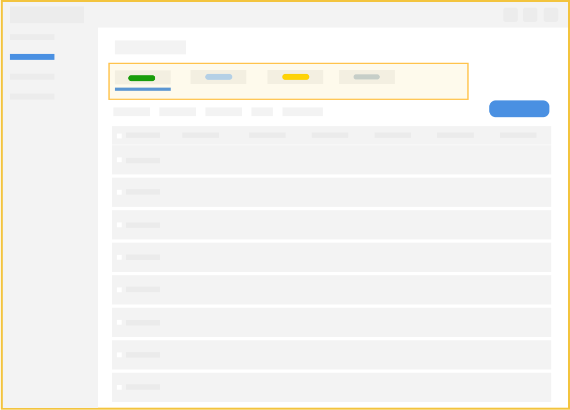
✅ Option 2: Status-based tabs for scale tickets
Pros: Download all the "NEW" scale tickets with just one click
Cons: Less flexible
Option 2 was chosen because it automatically filters out all the new scale tickets for users to review and download.
UI decision #2
Scale tickets contain a large amount of data, which is why users spend a lot of time reviewing information in Excel with Fulfillment 1.0. While the table view displays the most essential data for users to identify scale tickets, there is still a need for a detailed view.
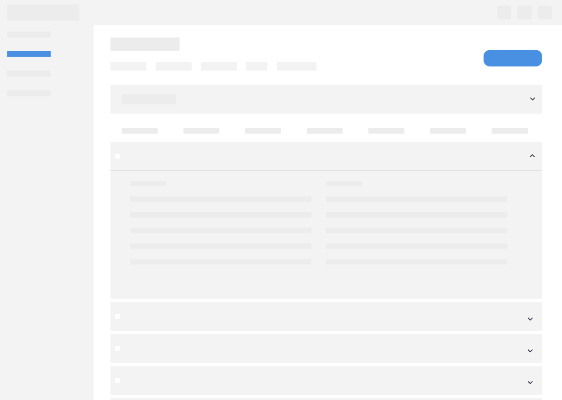
Option 1: Collapsable table row
Pros: Easier data comparison among tickets
Cons: Lengthy page; Easy to get lost
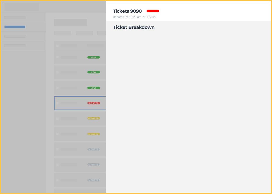
✅ Option 2: Side Panel
Pros: More focused View; More space:
Cons: Less flexible
Option 2 was selected because users do not need to compare data details between scale tickets. Additionally, this option provides more space to display all the data clearly.
Hi-fi prototype
By utilizing Bushel’s existing design system, I quickly transformed the wireframe into a high-fidelity prototype for usability testing.
Feature highlight#1: Set Thresholds for Error Detection
Users can configure grade factor thresholds on the settings page for various commodities.
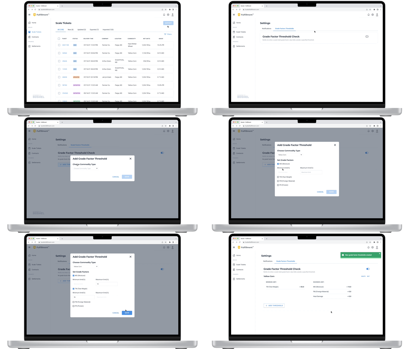
Feature highlight #2: Grade Factor Error Detection & Scale Ticket Detail Page
Users can quickly identify scale tickets with errors and pinpoint the abnormal grade factor on the ticket's detailed page.
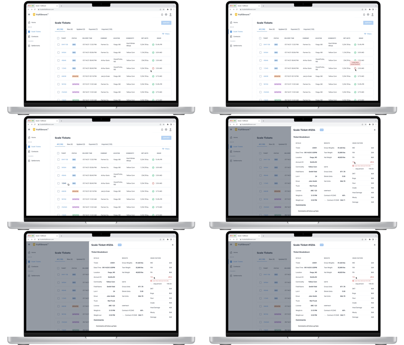
Feature Highlight #3: Export New Scale Tickets in an Importable Format
Users can export all new scale tickets together in a format compatible with their Enterprise Resource Planning (ERP) software. The system will also notify them if any tickets being exported contain errors.

Iterating after Usability Testing
In collaboration with the UX researcher, we conducted task-based usability testing with
users to:
Gauge their overall attitude towards the web experience.
Identify any usability issues in the current design.
After analyzing the collected data, we came to the conclusion that users would definitely
use and find the new web experience helpful once it becomes available. However, some
issues were discovered when participants performed the key tasks. Based on these findings,
I made some adjustments for the next iteration.
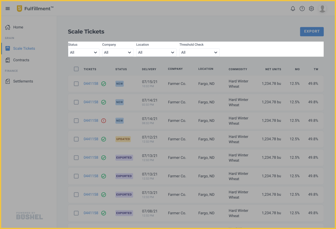
Adjustment #1: Status tabs to status filter
One main UI decision I made was found to be incorrect, highlighting the importance of testing. Participants need the ability to filter scale tickets by companies or commodities while reviewing ticket details and reconciling them with the contract. They find it more convenient to have everything on one page rather than setting up filters under each tab in the old design.
Before
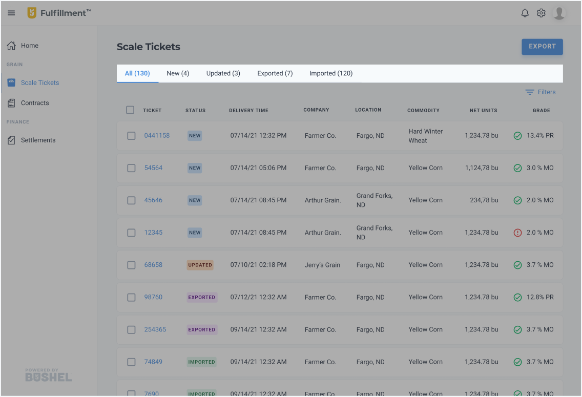
➡️ After
Adjustment #2: The presentation of grade factors & the location the error detection marker
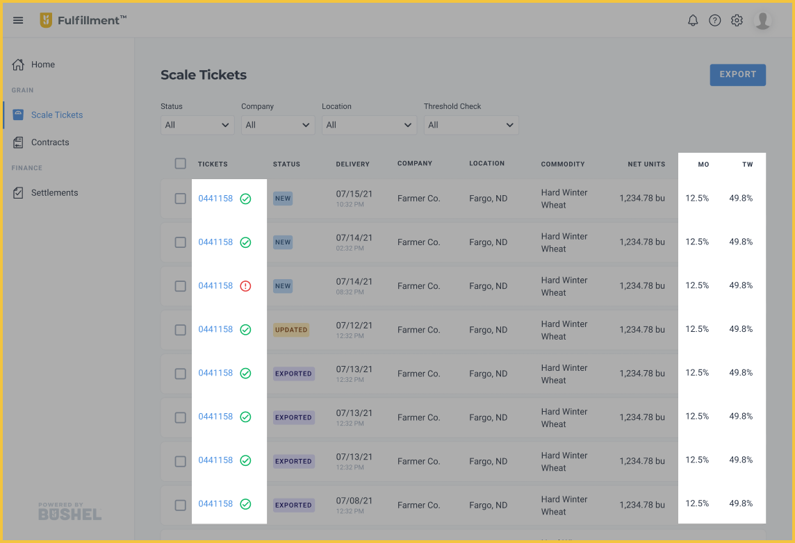
Previously, there was only one column displaying the primary grade factor of each commodity. However, during testing, participants found it confusing to see different grade factors in one column. They were also unsure if the check mark and exclamation mark indicated the status of the grade factor next to the marks or other factors in the ticket. Therefore, I changed the column heading from "Grade" to "MO (Moisture)" and "TW (Test Weight)," which are important for all commodities. Additionally, to address the second problem, I moved the threshold checking icon next to the ticket number.
Before
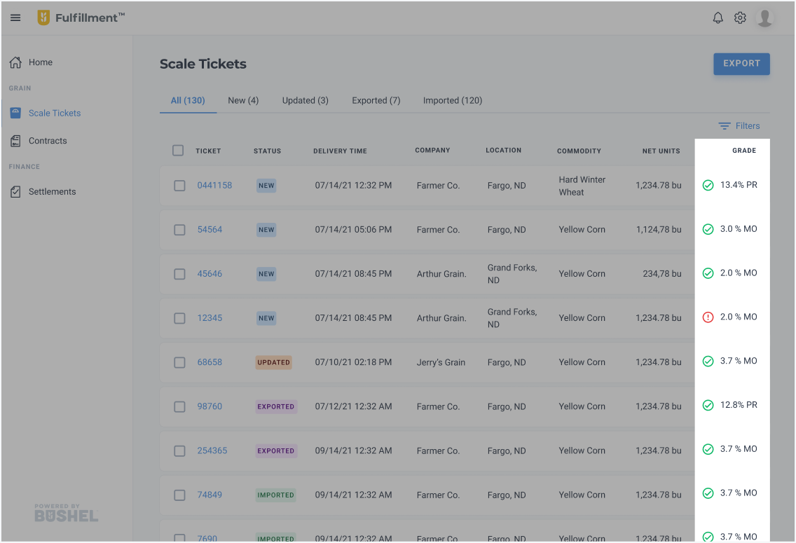
➡️ After
Adjustment #3: The flow and the representation of the thresholds
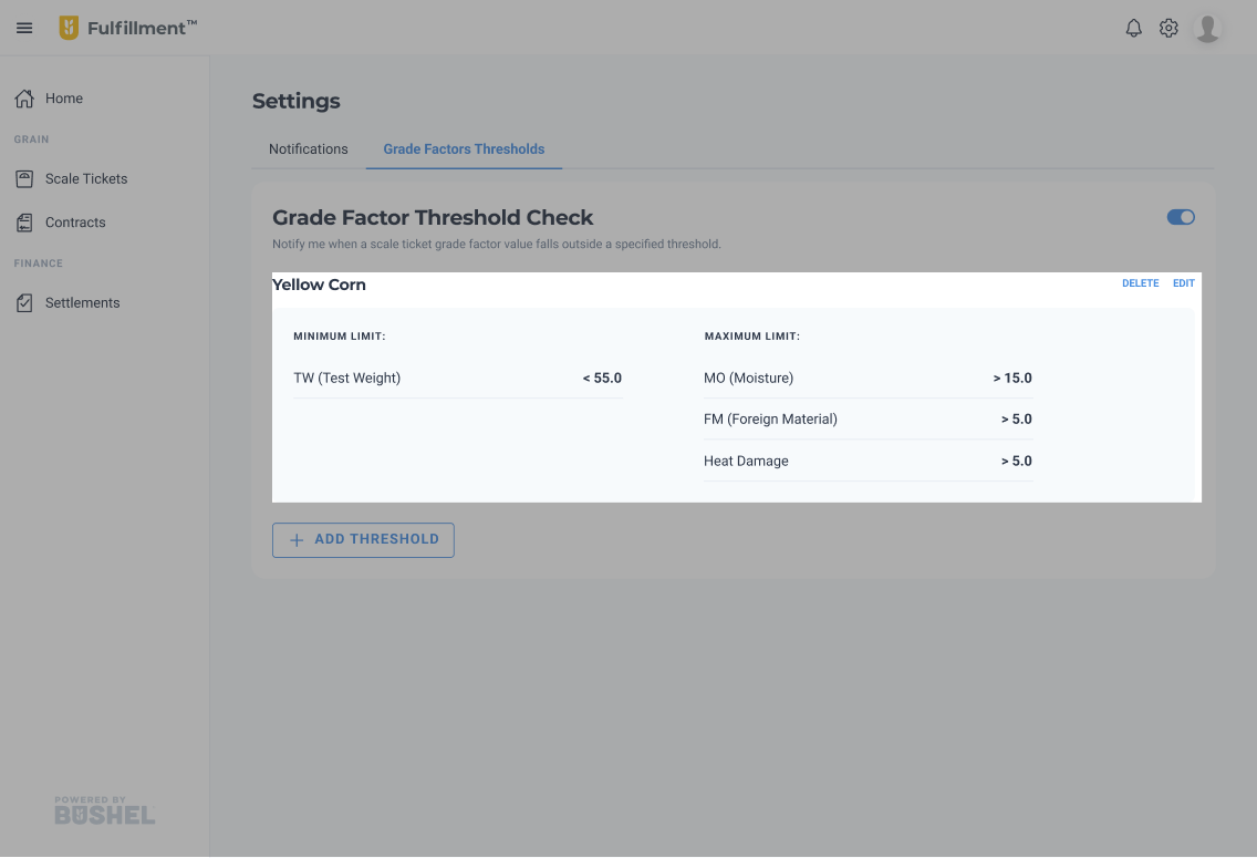
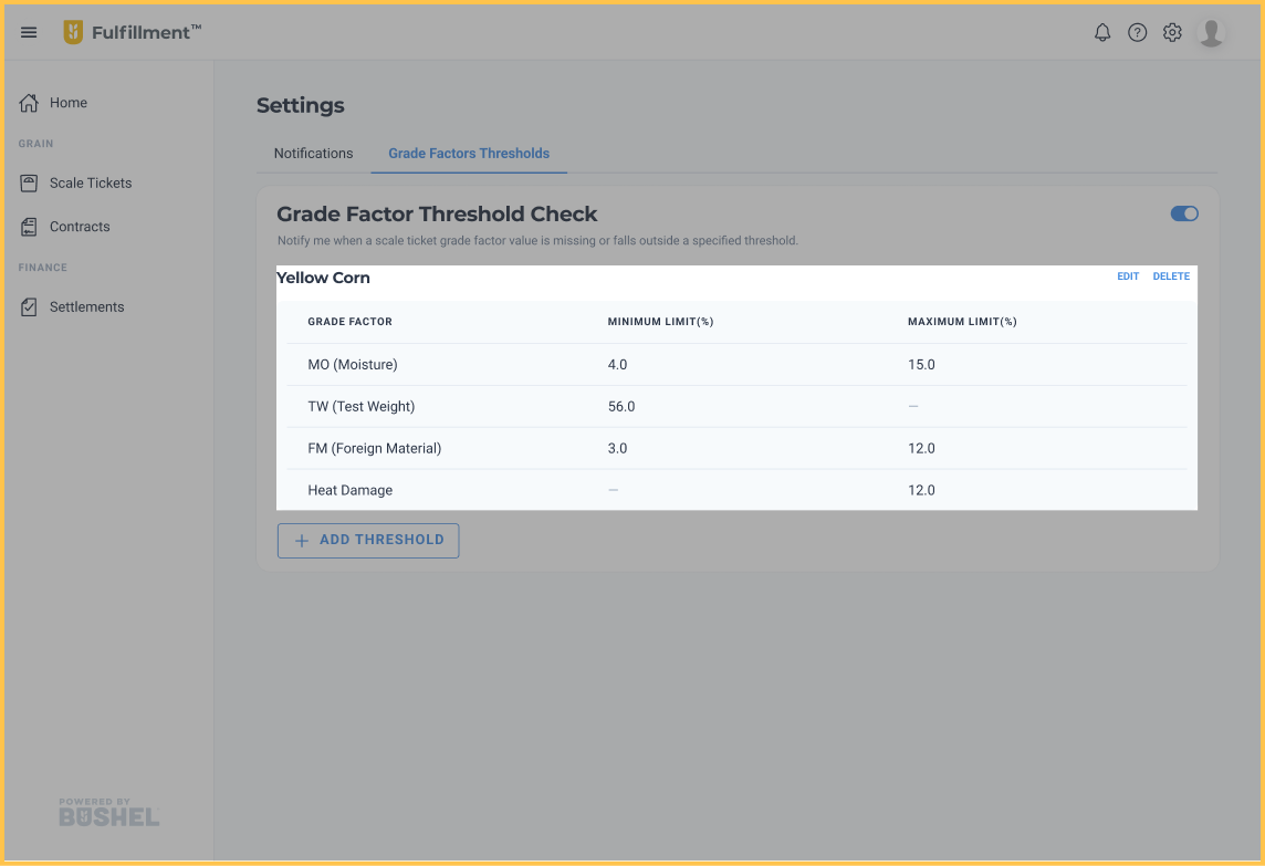
Based on my initial internal research, it seemed that users only needed to set thresholds for either minimum or maximum values, depending on the grade factors. However, during testing, participants mentioned that even though it’s rare, they still need the option to set both minimum and maximum values for all grade factors. I adjusted the design to accommodate this need.
Before
➡️ After
Next Steps
If I have more time, I would:
1. Continue to gather user feedback on the second iteration
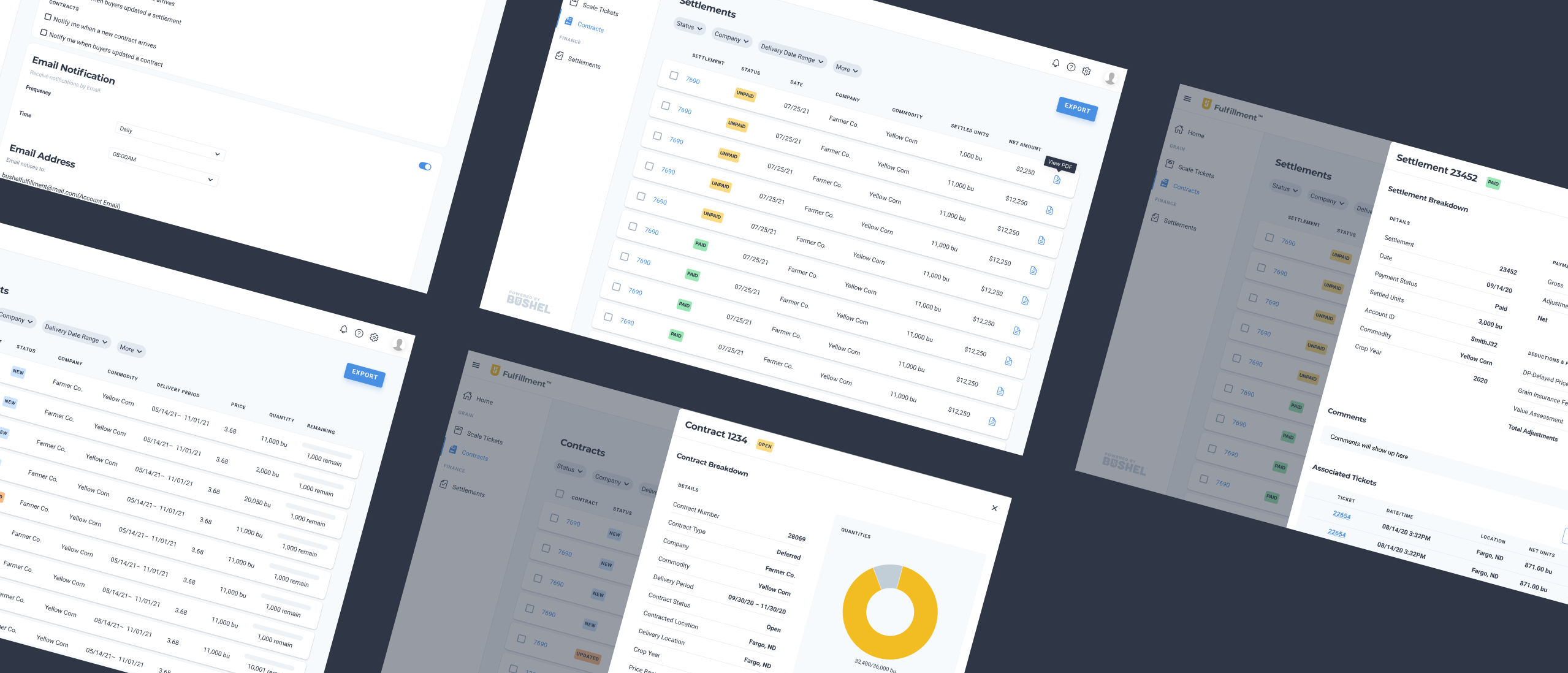
2. Refine, conduct testing and improve other features that got deprioritized ⬇️
IT’S LAUNCHED 🥳
At the end of my internship, I presented the solution to the executive team, and they expressed strong interests in adding this product to Bushel’s roadmap. A year later, I received a message from Andrew, the UX researcher I collaborated with:
“Just wanted to see how you've been and also let you know that Bushel is moving forward with the development of Fulfillment at the start of the new year. That shows how much they liked your designs that they want to move forward with the enhanced web experience :)”
Bushel fulfillment 2.0 was launched in 2023, and you can learn more about it here.
My key take-aways
Learned more about my self as a designer 🧚
As I said on my home page, “I’m a product designer focusing on B2B product,” and this project played an important role and helped me shape my career path. I found myself enjoy solving complex problems and creating products that empower people.
Collaboration with cross-functional team 🧑🤝🧑
Collaborating closely with researchers, PMs, and engineers greatly improved my teamwork skills. I learned how to plan and prioritize user stories to stay focused and avoid scope creep.